Strength?

Anonymous asked: When you were writing the book, how did you find the strength to work through such painful memories? How did you write through the especially difficult memories and keep going?

Drawing & Writing Through

I’m not sure that strength is a word I would choose to describe how I worked through Lighter Than My Shadow. From the moment I first had the idea, I knew it was something I would simply have to do, and I think the doing of it was more a matter of resolution than strength.

If I’m honest, I still question whether I really was strong enough to do it.  I waited years, until my eating disorder, the abuse, my recovery, was not a part of my daily life any more, not something I really had to think about. I had left it all behind. Then I made a conscious choice to go back there, to relive it and let it define my day-to-day life again, for as long as it would take me to write the book, and indeed for it to form part of my identity again once the book was out in the world. This had a powerful effect on me while writing, and continues to even now, long after the writing process has finished.

In very practical terms, there were certain parts of the book that were much more painful to work through than others. Writing about the abuse, in particular, which was much more raw and fresh in my mind than my anorexia, was a tough challenge. My natural instinct to protect myself from the memories meant every fibre of my body did not want to sit at my desk and draw what happened. In a way, drawing it felt more real than when the events themselves took place. As it happened I was traumatised, dissociated, watching as though it was happening to someone else. As I drew, I felt it happening to me, perhaps really accepted what had transpired for the first time. It is without question one of the hardest things I have ever done.

How did I keep going? Looking back, I’m not so sure! Apart from the resolution to do this thing, this idea for a book that just wouldn’t go away – and never wavered – I had a lot of support from my therapist, my friends and family, both in preparation for and during the drawing of those chapters. I also came up with some slightly laughable but very helpful strategies. Not surprisingly, I often found I was disturbed and discomfited by things I was drawing and had drawn. When there were several panels on a page I would tape paper over all but the one I was drawing at any given moment, hiding it from my peripheral vision. Sometimes I even isolated as little as a square inch of paper to work on so  I could focus on just a fragment, not letting myself see (and therefore feel) the whole thing.

Most of all – and anyone who is in recovery will surely understand this – my greatest tool, and my greatest challenge, was remembering to be kind to myself. As I immersed myself month after month in my past, old thought patterns began to resurface. Self-hatred, perfectionism, disgust at my body – things I thought I had long left behind – became real and present again. I began to question whether I had made any progress at all. When feelings like that creep in, it’s the hardest thing in the world to be nice to yourself. Taking my time, allowing myself to admit it was difficult. Practicing a moment-by-moment awareness that I was doing a hard thing, yet keeping doing it. Exactly like recovery itself.

I’m still practicing.

A short while ago I invited questions about any aspect of Lighter Than My Shadow, or the process of creating it, an offer which is very much still open. If you have something you’d like to ask, please do contact me and I’ll try to answer it in an upcoming blog post. This post is the first of my responses to those questions.

DELETED SCENES

In the process of creating Lighter Than My Shadow, most of the editing happened at the storyboard stage. I didn’t want to spend time making finished artwork for a scene that might later be cut, so I tried to make all those decisions whilst still working in rough.

Despite all my best efforts, though, there were some scenes that did get worked up into finished artwork but didn’t make it in to the book. Sometimes they just didn’t flow properly with the story, perhaps went into detail that wasn’t necessary or interesting, or confused the message I was trying to get across. Sometimes they were scenes  I’d put in for sentimental reasons: memories that were important to me but distracted from the story I was trying to tell, and this example is one of those.

This scene happens after a difficult mealtime, when I’ve just thrown my dinner across the room and stormed off (around page 159-160, if you have the book). My Dad has tried to comfort me with words but it didn’t help. What did help was the wordless support of our family dog, George.

Deleted page 160

Deleted page 161

Many of the deleted scenes I look back on and am glad they didn’t make the book. I can see in retrospect how they were perhaps clumsy or unnecessary, and know I made the right decision. With this one I’m not so sure.  I can certainly see how it’s not vitally important and doesn’t help the story in the same way as the version that appeared in the book. Still, I’m still a bit sad there wasn’t space for it, to show more of how important George was in that stage of my recovery.

THE BOOK IS HERE!

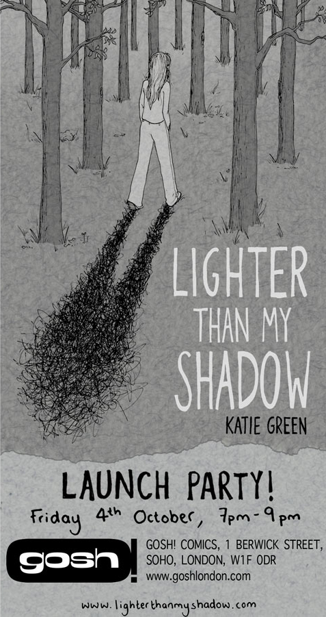
After years and years of hard work and preparation, Lighter Than My Shadow finally went out into the world on October 3rd. The above photos are from the launch party in Foyles, Bristol, taken by James Phillips.

It’s all been terribly exciting, and you can now buy copies of the book in actual bookshops as well as directly from me at several upcoming events or online, where of course I’d be delighted to sign it for you.


Adding the Text

Process #4

I always knew I wanted the text in Lighter Than My Shadow to be in my handwriting. Not a font of my handwriting, but every word handwritten. I had a few people tell me that was a crazy decision, but it surprised me that it turned out to be a lot less work than I thought. I kept the book’s text as sparse as possible, only adding words where absolutely necessary for dialogue or clarity in storytelling. The result was all the writing in the book fitting on less than 40 sides of A4 (although I do have very small writing…).

Scanned Text 1

Unlike the drawings which were made at actual size, I did adjust the scale of my handwriting. Because all my life I’ve had complaints that my handwriting is too small, I enlarged it slightly, by 16.6%.

Scanned Text 2

Setting the text happened in batches, usually 12 pages at a time at the end of a week’s drawing. I created the speech bubbles from the textured paper background, lightening it a little to stand out on the page, and I drew the tails in Photoshop using a Wacom tablet.

Scanned Text 3

…and that’s it! Apart from the beginning of every week, when I finalised the storyboards into pencil sketches, I was very simply a drawing machine. I continued like that, 12 pages a week every week for 14 months like clockwork.

Well, not quite. Because I am not a drawing machine, I am a person. And the story I was working on was not exactly something I could detach myself from. My plan was to work at 12 pages a week, every week for 14 months, and the book would be done just like that. Instead it was unlike anything I could have anticipated at all.

‘Colouring’

Process #3

If I was having a good week, I managed to draw 4 pages a day on Monday, Tuesday and Wednesday, leaving me to scan, colour and add the text on Thursday and Friday (and usually Saturday and often Sunday). Throughout the process I referred to what I did in the latter half of my weeks as ‘colouring’, though in the finished work there is very little discernible colour to be seen.

Technical stuff. After scanning the images, I adjusted them in Photoshop to remove the yellow of my chosen paper and leave me with a crisp black line. This I laid over my textured paper background, and manipulated the creases to form my panel borders. I then coloured the image – perhaps shaded is a more suitable term – using a very limited range of black and white in varying opacities (so the texture of the paper would show through).

Scanned Panels

Black Line

Line and Textured Paper

Figures in White

I shaded figures in white, with the opacity turned down to 40%. I kept this very simple, not using any other colours for clothes or hair for any characters. Furniture or any other scenery I shaded black, with opacity of 20 or 10%.

Black Colouring

At first this process was verrrrrrry slow, and I worried about my ability to keep up with my schedule. By the middle of things I had a good routine and usually felt confident of getting things done on time. By the end of my 14-month drawing extravaganza I was a whizz at my particular and peculiar Photoshop colouring formula.

Shaded Background

Another thing relating to colour. I left all the backgrounds the same shade of grey until I’d finished a whole chapter. At that point I would make a decision about the tone of the story, emotionally and therefore colour-wise, and would adjust the backgrounds of the chapter accordingly. The result is subtle shifts in colour that I think you will barely notice as you turn from page to page. But dipping in and out of sections the change is more pronounced and – what came as a nice surprise – the finished book has an ombré effect in profile that I find very pleasing indeed.

Ombre Pages

From Pencils to Inks

inking

Process #2

After the pencilling, truly all the creative decisions had been made and I found the process from then on to be – comparatively – relaxing. I could put some music on, or an audiobook, and settle in for an afternoon of inking.

Throughout the process I used 01 and 005 Pigma Micron pens which I went through by the boxful. I always inked a whole page with a 01 first, going back over it with a 005 to add finer details afterwards.

When I wore the pen nibs down to nubs, which was inevitable, I marked them and put them aside. Not quite the in pen graveyard, because these nubbins were ideal for the scribble-scrawl, the main visual metaphor for my illness, which appears to greater or lesser extent throughout the book.

pen-graveyard

Only after every bit of ink had been scribbled out of them did the pens become defunct, but I still couldn’t bear to part with them. Somehow the growing stack of dead pens felt like more of an achievement than the growing stack of artwork piling up around my studio. And yes, I am still hoarding all the dead pens.

From Storyboards to Pencils

Pencils

Process #1

When I was working on Lighter Than My Shadow, I mostly followed a very strict and orderly routine according to the wallchart. This was necessary to constantly remind me that as long as I kept on top of what needed to be done – week by week, day by day – I could deliver a 500 page book within the deadline.

Roughly, I drew 12 pages per week for a little over 14 months. This rate was possible because I opted for a pared down visual style, and also because I’d spent the better part of the preceding three years planning. I no longer had much creative thinking to do, I just needed to draw.

The first stage in creating a page of finished artwork was to translate my storyboard to a full-size pencil sketch ready for inking. Often at this stage I would make some changes if I had an idea for a better composition or panel progression. I was also incorporating the last round of editorial feedback so the last storyboards and the final artwork often diverged a surprising amount. These changes I planned as very quick thumbnail sketches that were only understandable the day I drew them – looking back they make very little sense, and I can only sometimes match them to the corresponding finished page!

storyboard

Technical stuff. I drew each double page spread as a single piece of artwork at actual size (390 x 255mm). I drew on A3 recycled xerox paper but I wish I hadn’t. I chose it because it’s cheap, and therefore less intimidating. I get very frightened by using posh paper, and afraid to start work, but if I’m using something like xerox paper which is so cheap it feels disposable, I’m a little less precious. It also happens to take Pigma Micron pens (size 01 and 005) very well. The downside of this cheap paper is that it’s non-archival, and, let’s be honest, downright flimsy. When I was deep in the process of Lighter Than My Shadow, the last thing I was thinking of was exhibiting or even selling artwork. Now the slog is behind me, I have 250 original pieces that I’m sure people would love to see, but they’re on cheap, rapidly yellowing paper that wouldn’t look nice hung on a wall and certainly isn’t saleable. I plan to get more comfortable with expensive paper in future.

I pencilled 4 pages – 2 double pages spreads – at a time, which would usually take a morning, giving the afternoon and evening for inking (that’s tomorrow’s post).