DELETED SCENES

In the process of creating Lighter Than My Shadow, most of the editing happened at the storyboard stage. I didn’t want to spend time making finished artwork for a scene that might later be cut, so I tried to make all those decisions whilst still working in rough.

Despite all my best efforts, though, there were some scenes that did get worked up into finished artwork but didn’t make it in to the book. Sometimes they just didn’t flow properly with the story, perhaps went into detail that wasn’t necessary or interesting, or confused the message I was trying to get across. Sometimes they were scenes  I’d put in for sentimental reasons: memories that were important to me but distracted from the story I was trying to tell, and this example is one of those.

This scene happens after a difficult mealtime, when I’ve just thrown my dinner across the room and stormed off (around page 159-160, if you have the book). My Dad has tried to comfort me with words but it didn’t help. What did help was the wordless support of our family dog, George.

Deleted page 160

Deleted page 161

Many of the deleted scenes I look back on and am glad they didn’t make the book. I can see in retrospect how they were perhaps clumsy or unnecessary, and know I made the right decision. With this one I’m not so sure.  I can certainly see how it’s not vitally important and doesn’t help the story in the same way as the version that appeared in the book. Still, I’m still a bit sad there wasn’t space for it, to show more of how important George was in that stage of my recovery.

Adding the Text

Process #4

I always knew I wanted the text in Lighter Than My Shadow to be in my handwriting. Not a font of my handwriting, but every word handwritten. I had a few people tell me that was a crazy decision, but it surprised me that it turned out to be a lot less work than I thought. I kept the book’s text as sparse as possible, only adding words where absolutely necessary for dialogue or clarity in storytelling. The result was all the writing in the book fitting on less than 40 sides of A4 (although I do have very small writing…).

Scanned Text 1

Unlike the drawings which were made at actual size, I did adjust the scale of my handwriting. Because all my life I’ve had complaints that my handwriting is too small, I enlarged it slightly, by 16.6%.

Scanned Text 2

Setting the text happened in batches, usually 12 pages at a time at the end of a week’s drawing. I created the speech bubbles from the textured paper background, lightening it a little to stand out on the page, and I drew the tails in Photoshop using a Wacom tablet.

Scanned Text 3

…and that’s it! Apart from the beginning of every week, when I finalised the storyboards into pencil sketches, I was very simply a drawing machine. I continued like that, 12 pages a week every week for 14 months like clockwork.

Well, not quite. Because I am not a drawing machine, I am a person. And the story I was working on was not exactly something I could detach myself from. My plan was to work at 12 pages a week, every week for 14 months, and the book would be done just like that. Instead it was unlike anything I could have anticipated at all.

‘Colouring’

Process #3

If I was having a good week, I managed to draw 4 pages a day on Monday, Tuesday and Wednesday, leaving me to scan, colour and add the text on Thursday and Friday (and usually Saturday and often Sunday). Throughout the process I referred to what I did in the latter half of my weeks as ‘colouring’, though in the finished work there is very little discernible colour to be seen.

Technical stuff. After scanning the images, I adjusted them in Photoshop to remove the yellow of my chosen paper and leave me with a crisp black line. This I laid over my textured paper background, and manipulated the creases to form my panel borders. I then coloured the image – perhaps shaded is a more suitable term – using a very limited range of black and white in varying opacities (so the texture of the paper would show through).

Scanned Panels

Black Line

Line and Textured Paper

Figures in White

I shaded figures in white, with the opacity turned down to 40%. I kept this very simple, not using any other colours for clothes or hair for any characters. Furniture or any other scenery I shaded black, with opacity of 20 or 10%.

Black Colouring

At first this process was verrrrrrry slow, and I worried about my ability to keep up with my schedule. By the middle of things I had a good routine and usually felt confident of getting things done on time. By the end of my 14-month drawing extravaganza I was a whizz at my particular and peculiar Photoshop colouring formula.

Shaded Background

Another thing relating to colour. I left all the backgrounds the same shade of grey until I’d finished a whole chapter. At that point I would make a decision about the tone of the story, emotionally and therefore colour-wise, and would adjust the backgrounds of the chapter accordingly. The result is subtle shifts in colour that I think you will barely notice as you turn from page to page. But dipping in and out of sections the change is more pronounced and – what came as a nice surprise – the finished book has an ombré effect in profile that I find very pleasing indeed.

Ombre Pages

From Pencils to Inks

inking

Process #2

After the pencilling, truly all the creative decisions had been made and I found the process from then on to be – comparatively – relaxing. I could put some music on, or an audiobook, and settle in for an afternoon of inking.

Throughout the process I used 01 and 005 Pigma Micron pens which I went through by the boxful. I always inked a whole page with a 01 first, going back over it with a 005 to add finer details afterwards.

When I wore the pen nibs down to nubs, which was inevitable, I marked them and put them aside. Not quite the in pen graveyard, because these nubbins were ideal for the scribble-scrawl, the main visual metaphor for my illness, which appears to greater or lesser extent throughout the book.

pen-graveyard

Only after every bit of ink had been scribbled out of them did the pens become defunct, but I still couldn’t bear to part with them. Somehow the growing stack of dead pens felt like more of an achievement than the growing stack of artwork piling up around my studio. And yes, I am still hoarding all the dead pens.

From Storyboards to Pencils

Pencils

Process #1

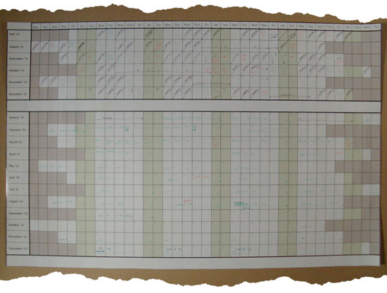
When I was working on Lighter Than My Shadow, I mostly followed a very strict and orderly routine according to the wallchart. This was necessary to constantly remind me that as long as I kept on top of what needed to be done – week by week, day by day – I could deliver a 500 page book within the deadline.

Roughly, I drew 12 pages per week for a little over 14 months. This rate was possible because I opted for a pared down visual style, and also because I’d spent the better part of the preceding three years planning. I no longer had much creative thinking to do, I just needed to draw.

The first stage in creating a page of finished artwork was to translate my storyboard to a full-size pencil sketch ready for inking. Often at this stage I would make some changes if I had an idea for a better composition or panel progression. I was also incorporating the last round of editorial feedback so the last storyboards and the final artwork often diverged a surprising amount. These changes I planned as very quick thumbnail sketches that were only understandable the day I drew them – looking back they make very little sense, and I can only sometimes match them to the corresponding finished page!

storyboard

Technical stuff. I drew each double page spread as a single piece of artwork at actual size (390 x 255mm). I drew on A3 recycled xerox paper but I wish I hadn’t. I chose it because it’s cheap, and therefore less intimidating. I get very frightened by using posh paper, and afraid to start work, but if I’m using something like xerox paper which is so cheap it feels disposable, I’m a little less precious. It also happens to take Pigma Micron pens (size 01 and 005) very well. The downside of this cheap paper is that it’s non-archival, and, let’s be honest, downright flimsy. When I was deep in the process of Lighter Than My Shadow, the last thing I was thinking of was exhibiting or even selling artwork. Now the slog is behind me, I have 250 original pieces that I’m sure people would love to see, but they’re on cheap, rapidly yellowing paper that wouldn’t look nice hung on a wall and certainly isn’t saleable. I plan to get more comfortable with expensive paper in future.

I pencilled 4 pages – 2 double pages spreads – at a time, which would usually take a morning, giving the afternoon and evening for inking (that’s tomorrow’s post).


Drafts 2, 3, 4…

Never Good Enough

In truth I don’t know how many drafts I went through. Perhaps four or five of the entire book, but some sections were certainly reworked much more than that. Some sections have changed very little from that first draft, others are unrecognisable.

Perhaps I don’t need to tell you that I’m a perfectionist. It goes hand in hand with anorexia (though I’ve recovered from one, I’m not sure there’s any hope for the other). With that in mind, I’m sure you’ll understand that I was never going to feel ready. To go through one final draft and decide “That was it, it’s finished, now I’m ready to start drawing,” was never going to happen.

I know that’s how my brain works, but still, I was expecting the final draft to be more…done.

What decided the final draft, in the end, was time. I wanted this book to come out in 2013, the year I turn 30, and therefore I needed to set pen to paper in 2012. Or perhaps earlier than that, but it was 2012 already so that would have to do.

THE WALL CHART

wall-chart

With the time for faffing drafting and redrafting over, I had to find a way not to feel overwhelmed by the sheer volume of drawing ahead of me. I used a very simple formula: divide the number of pages that need drawing by the number of days I have to draw (allowing myself the occasional weekend, and a week’s holiday halfway through). The number I came up with was 12 pages a week. So long as I could stick to that target, I could stop worrying about the whole massive thing and worry only about 12 pages at a time.

This wasn’t quite enough to settle my nerves, so I made a wall chart breaking down exactly when I would tackle each section. Seeing it all laid out in front of me, with clearly enough space to hit the deadline, felt very comforting.

It’s perhaps important to acknowledge that this extreme level of meticulous planning is not dissimilar to the way I used to plan my meals when I was anorexic…

ON BEING EDITED

Being Edited

The first time around, I found the experience of being edited…uncomfortable. I handed over a massive chunk of work that I wasn’t really happy with (not to mention how personal it was – there were parts of the story in there I’d never even told my therapist). The person reading it was someone I barely knew but, being an editor at Jonathan Cape, someone I had great reverence for. I left the pages with him, and I waited.

In the time between handing over the pages and our first editorial meeting, my imagination got to work on dreaming up all the possible negative feedback I could receive. Surely Jonathan Cape were now going to realise what a big mistake they’d made, and tell me they were sorry, but they longer wished to publish the book.

As I travelled to London and walked into Random House, signing my name on my visitor’s name tag, I felt like an imposter. This was something real authors did, not me. Then my mountainous first draft was placed on the table, covered in post-its and green (thankfully not red!) notes…

And my editor told me he liked it.

That’s how I remember the beginning of the professional relationship that really shaped my work on Lighter Than My Shadow. To have that input right from the earliest stages was incredibly valuable. Though it terrified me at first, he was always sensitive and professional, discussing the book almost as a work of fiction, yet never seeming to lack in empathy for it being a true story. Though it made me squirm to listen to and read comments on work I wasn’t happy with, it got easier. I came to appreciate the help and support in working towards something I felt proud of, shaping it into the book I’d started imagining almost ten years beforehand. In time, the relationship became (or perhaps always was, I just misunderstood it) less pupil-teacher, more mutually respectful. A collaboration for the best interests of the story.

Over the following two years we exchanged multiple drafts and redrafts, poking and prodding at the story here and there, taking out entire chunks and sometimes putting them back in again a few months later. Always I got nervous. Always the book got better.

I understand from a recent article written by mine that editors like “to remain invisible, for the work [they] do to be untraceable to the reader; for the book to appear, as Martin Amis has put it, ‘a transfusion from above’, direct from writer’s pen to reader’s eye.” While I value this and agree entirely that’s what a good editor should aspire to, I also think it’s a shame. I don’t like it when people are unappreciated for doing great work, and it’s impossible for me to talk about my creative process without talking about the value of the editorial input I was fortunate enough to receive.

The first time around, I found the experience of being edited uncomfortable, but draft after draft it became easier, and I looked forward to receiving that feedback and support. In the end it was a great pleasure and privilege, enabling me to craft a piece of work to a level I never could have managed alone.

Thanks Alex!